Data is everywhere. Whether it’s political survey data, the DNA sequences of wacky organisms, nutritional profiles of our favourite foods, you name it. Data comes in various shapes and sizes, too - it can be several thousand samples with only a few features, or only a small number of examples with tons of features. For either case, and anything else in between, finding a lower-dimensional (i.e. fewer features) representation of our data is useful; however, how do we choose which features to use for capturing the essence of our data? This is where principal component analysis (PCA) becomes incredibly useful.
If you’ve got…
- 30 seconds: Using linear algebra, we can project our data onto a lower-dimensional space according to the co-variance of our data features. The first two components resulting from a PCA run explain the largest proportion of variance in the data.
- 7 minutes or more: Read the code and the walk-through.
# import all the fancy stuff
import pandas as pd
import seaborn
import numpy as np
import matplotlib.pyplot as plt
import plotly
from sklearn.decomposition import PCA
# let's get some nutrition data from starbucks, courtesy of Kaggle
df = pd.read_csv("../../data/starbucks-menu/starbucks-menu-nutrition-drinks.csv")
df.head()
.dataframe tbody tr th {
    vertical-align: top;
}

.dataframe thead th {
    text-align: right;
}
Before we do any type of analysis, we should clean up this table; there are cases where some values are simply “-” (which I will assume is null). For the purpose of this exercise, where calories are “-”, I will remove these items from the “menu”. Furthermore, I’ll also standardise “-” into a np.nan value.
# pandas dataframes have a built-in replace function
nullified = df.replace("-", np.nan).copy()

# Get those with non-null calories
clean_df = nullified[~pd.isnull(nullified["Calories"])].copy()
clean_df.head()
.dataframe tbody tr th {
    vertical-align: top;
}

.dataframe thead th {
    text-align: right;
}
For each item in the drinks menu, we have a series of features, such as the amount of fat, etc. We would expect some of these numbers to correlate with each other to some degree, e.g. fatty foods tend to have more sodium. We can test that expectation visually through the use of a correlation plot.
To start, I will only get nutrients, and not calories (i.e. the third column onwards). I have chosen not to get calories because it’s effectively a weighted sum of all the other nutrients, so it’s sort of redundant.
Furthermore, because we had had the “-” character in the dataframe beforehand, I will assert that the sub-frame is numeric. Also, sodium tends to be listed in miligrams, so I will scale this down too.
relevant_columns = clean_df.columns[2:]
nutrition = clean_df[relevant_columns].apply(pd.to_numeric)
nutrition['Sodium'] /= 1000. # scale-down sodium
nutrition.index = range(nutrition.shape[0]) # reset the index for the pandas dataframe
Now let’s get that plot! As a case study, I will colour the item with the highest fibre content as purple, and the rest as Starbucks green ;)
colours = [ '#00704a' if i != nutrition['Fiber (g)'].idxmax() else '#9b59b6' for i in range(nutrition.shape[0]) ]

grid = seaborn.PairGrid(nutrition)
grid.map_diag(plt.hist, color = '#00704a')
grid.map_lower(plt.scatter, color = colours)

# Hide the upper-triangle since it's a bit redundant.
for i, j in zip(*np.triu_indices_from(grid.axes, 1)):
    grid.axes[i, j].set_visible(False)
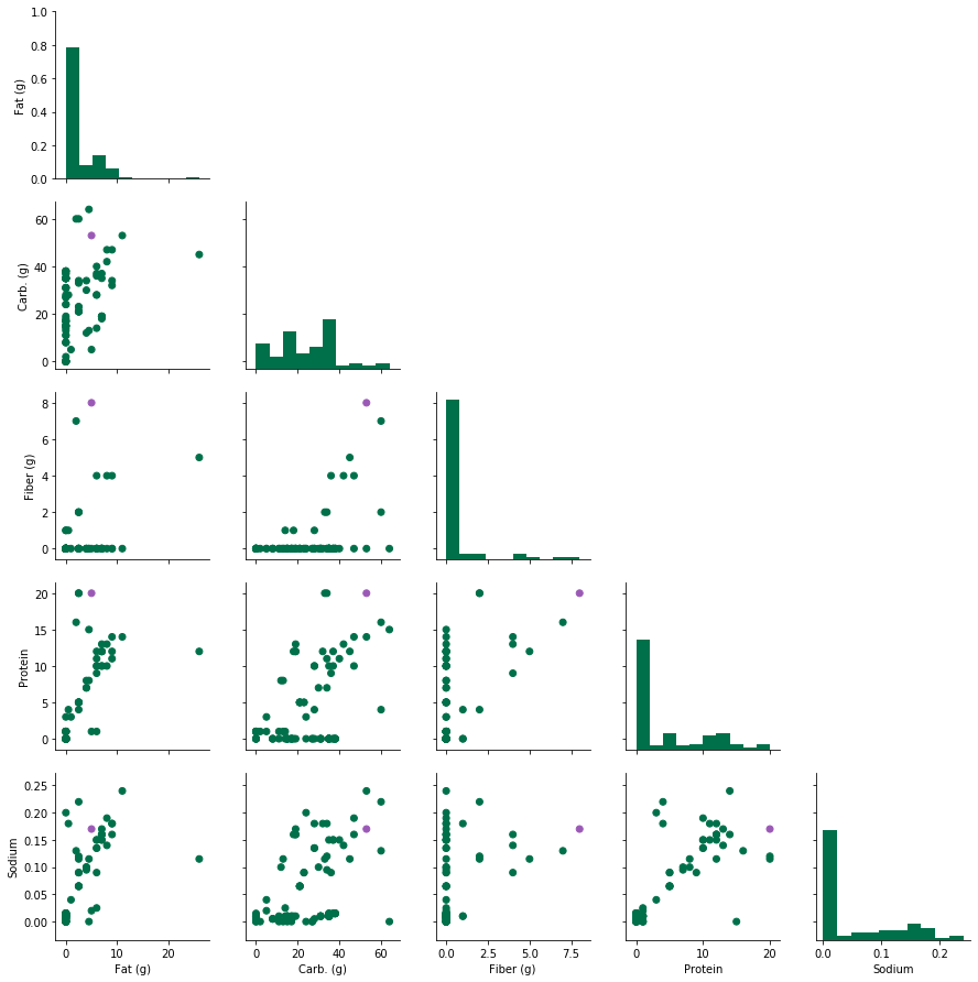
There are interesting patterns that we can see here already - for instance, the amount of sodium seems to increase with respect to protein content, while fibre is almost invariant. Another feature we can see is that the food with the highest amount of fibre does not necessarily have the highest fat or carb content, etc. In summary,
- Some nutrients co-vary with one another
- Each food/drink item has its own unique combination fat/carb/fibre/protein/sodium values.
Given these two observations, it would be convenient to compress the above plot into a single plot with two dimensions, while capturing any and all variation in the nutrient data. This is where PCA gets handy.
These are the three core steps to a PCA run:
- Centre our data to have 0-mean per column.
- Compute the co-variance matrix from the centred data. Alternatively we can calculate the correlation matrix of the raw data.
- Determine the eigenvectors/eigenvalues of the co-variance or correlation matrix. (NB: an eigenvector v of a matrix A is one that does not change direction when it is transformed by A; it can be explained by a stretch of v by a scalar $$\lambda$$, i.e., $$Av = \lambda v$$
In scikit-learn, this is a really easy job:
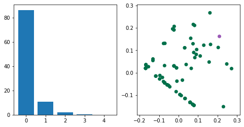
X = data - data.mean()
pca = PCA(n_components = 2) # number of desired principal components
pca.fit(X) # job's done
But I will go through a more manual process below:
# Manual procedure; centre the data by subtracting the mean.
X = (nutrition - nutrition.mean())

# Each row is an observation, hence rowvar = False. Eigen-decompose the covariance matrix
cov = np.cov(X, rowvar=False)
eigenval, eigenvec = np.linalg.eig(cov)

# To project the original data onto PC space, take the dot product of the data w.r.t. the eigenvectors
projected = np.dot(X, eigenvec)
# Just plot the results
fig, ax = plt.subplots(1,2)
ax[0].bar(range(len(eigenval)), eigenval/sum(eigenval)*100)
ax[1].scatter(
    projected[:,0], projected[:,1], color = colours
)

ax[0].set_title("Explained variance per PC")
ax[1].set_title("Projected foods onto PC space")

fig.set_size_inches((8,4))
What do the above plots tell us? The majority of the variation in the data can be represented by the first and second principal components; this can be measured by looking at the ratio of the ith eigenvalue with respect to the sum of all eigenvalues (left plot).
Each eigenvector represents the “directions” of a matrix A, and the corresponding (reminder: scalar!) eigenvalues represent the magnitude of those directions. In other words, the eigenvectors with the largest eigenvalues represent the greatest sources of variation in A. There can be up to $$k$$ eigenvectors for a $$n \times k$$ matrix, though in practice, we only use $$p$$ eigenvectors ($$p < k$$) for the purpose of a PCA.
If we use plotly, then we can see where drinks are found within the PC space.
import plotly.graph_objects as go

plot_df = pd.DataFrame(list(zip(clean_df[clean_df.columns[0]], projected[:,0], projected[:,1])), columns = ['Menu item', 'PC1', 'PC2'])

fig = go.Figure()
fig.add_trace(
    go.Scatter(
        x = plot_df['PC1'], y = plot_df['PC2'],
        text = plot_df['Menu item'],
        mode = 'markers',
        marker_color = colours
    )
)
fig.show()
bonus section
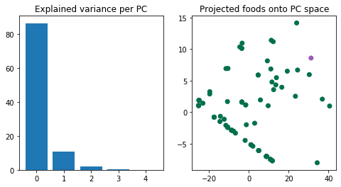
Nowadays, PCA is done by singular value decomposition (SVD) over eigen-decomposition of covariance matrices. It’s not only more efficient, but it is also the de facto method for PCA methods, such as the scikit-learn implementation. Again, we can breakdown the SVD steps to see how it works (roughly). This thread
provides an excellent in-depth coverage.
# apply singular value decomposition of the zero-centred data, rather than a covariance matrix
u, s, vt = np.linalg.svd(X)

# the projected points are already represented in u
projected = u

# the eigen values are acquired by multiplying sigma with itself, divided by n-1
eigenval = np.square(s) / (X.shape[0]-1)

fig, ax = plt.subplots(1,2)
ax[0].bar(range(len(eigenval)), eigenval/sum(eigenval)*100)
ax[1].scatter(projected[:,0], projected[:,1], color = colours)

fig.set_size_inches((8,4))